Redefining an Internal Production System Used by 400+ Employees
Phantom FX initially approached me for freelance work in January 2021. After reviewing their internal production management tool and understanding its operational impact, I proposed a full system rethink rather than a surface-level UI redesign. I later joined full-time as the UI/UX Designer to lead the transformation.
This project evolved from “fix the interface” to rebuilding how 200+ artists and 15+ managers coordinate 10,000+ tasks per project.
Highlights
- Took ownership of a failing internal system with <10% adoption and <10 SUS score
- Conducted cross-functional research across 8 departments to uncover workflow mismatches
- Reframed the challenge from a UI cleanup to a structural workflow redesign
- Rebuilt information architecture around real studio operations instead of assumed task logic
- Introduced Gantt-based scheduling to replace manual Excel resource tracking
- Reduced heavy data-fetch bottlenecks by redesigning how task data was loaded
- Increased adoption to 97% across departments within 6 months
- Improved System Usability Scale score to 90+
The Problem
The Scale of Operations
Phantom FX handles film projects consisting of:
- 3–4 sequences per project
- ~200 shots per sequence
- 4–5 tasks per shot (2D, 3D, rigging, modelling, etc.)
That results in roughly 10,000 individual tasks per project.
These tasks were coordinated across:
- ~200 VFX artists
- 15+ managers and production stakeholders
The internal tool was meant to centralize this complexity.
Instead, it became a bottleneck.
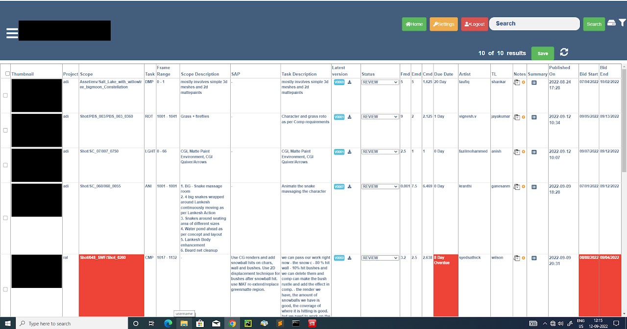
What Was Actually Broken
The system was built without a designer. On the surface, it looked like a UI problem.
Underneath, it was a systems problem.
Technical Friction
- Pages took 10+ minutes to load due to fetching massive datasets (up to 24,000 specifications at once)
- Task logic assumed one task = one artist = one continuous execution
- Data-heavy tables forced users to parse everything at once
Operational Misalignment
Through interviews, I discovered something more critical:
The software assumed linear task completion.
Reality was dynamic.
Artists frequently paused tasks for higher-priority shots. Coordinators would duplicate tasks in the system to reassign work. Excel sheets were being used outside the tool to track real workload.
The product wasn’t failing because of UI inconsistency.
It was failing because it didn’t reflect how production actually worked.
Research & System Understanding
I conducted interviews across 8 roles:
- Line Producers
- Coordinators
- Supervisors
- Team Leads
- Artists
- Finance
Rather than asking “what UI is confusing?”, I mapped:
- How tasks actually moved between people
- Where bottlenecks occurred
- How priorities shifted
- How budgeting decisions were made
This exposed a core insight:
The studio didn’t need better task tables.
They needed operational visibility.
Reframing the System
Instead of redesigning screens, I redesigned the logic.
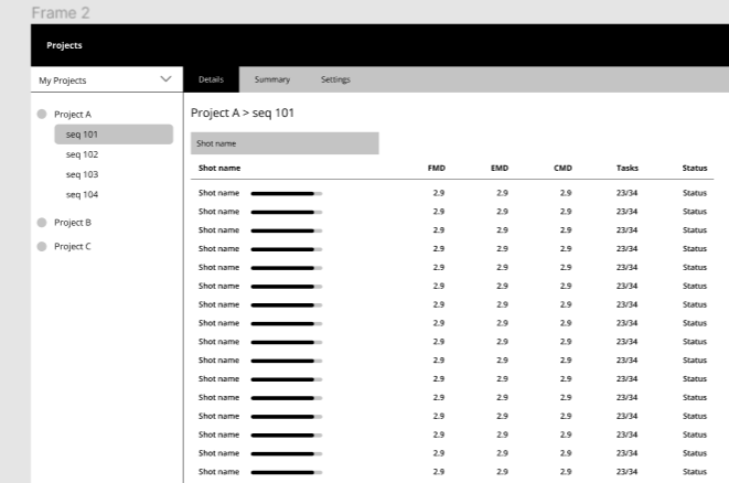
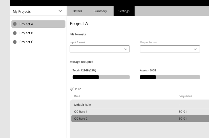
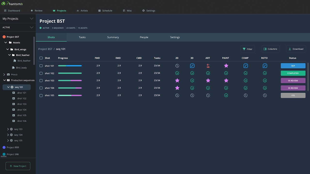
1. Fixing the Information Architecture
The previous structure forced users to navigate multiple rigid pages per role.
I introduced:
- A revised project structure with subtasks for flexible reassignment
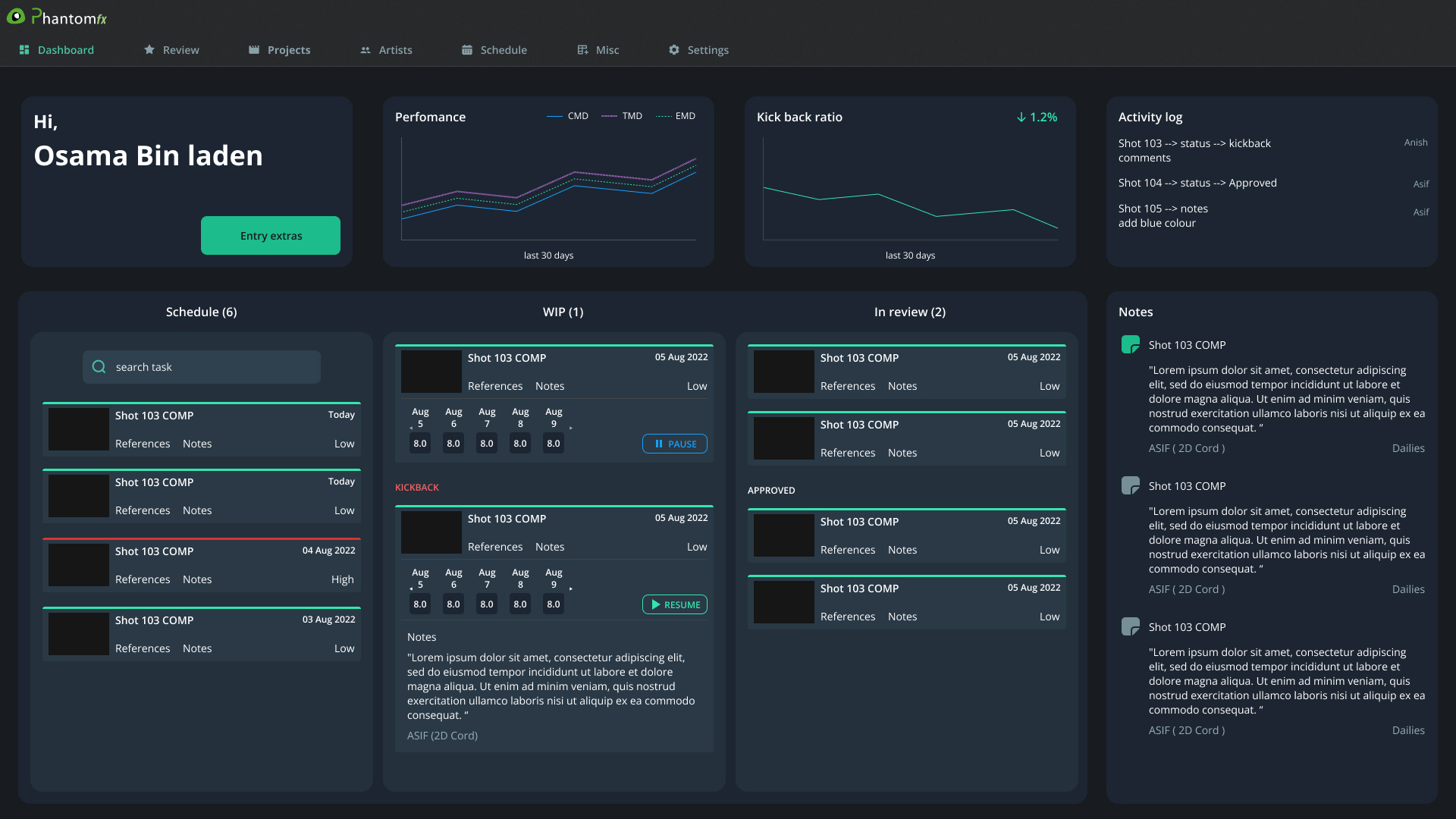
- Role-based dashboards tailored to decision needs
- Contextual modals to load task details on demand instead of fetching all 24,000+ data points at once
This significantly reduced load times and improved perceived performance without requiring backend overhauls.
The goal wasn’t visual polish.
It was cognitive and technical efficiency.
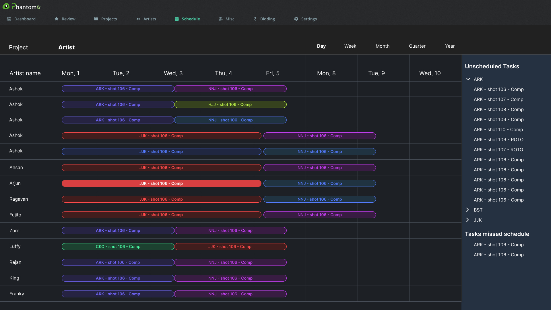
2. Replacing Excel With Visibility
One of the biggest operational pain points was resource tracking.
Coordinators manually tracked artist availability in Excel because the system couldn’t visualize capacity or future allocation.
Instead of building complex automation, I introduced a Gantt-based scheduling view:
- Visual timeline of artist workload
- Clear visibility into unassigned or overbooked artists
- Support for shifting priorities without duplicating tasks
This replaced parallel spreadsheet workflows and gave production leadership real-time clarity.
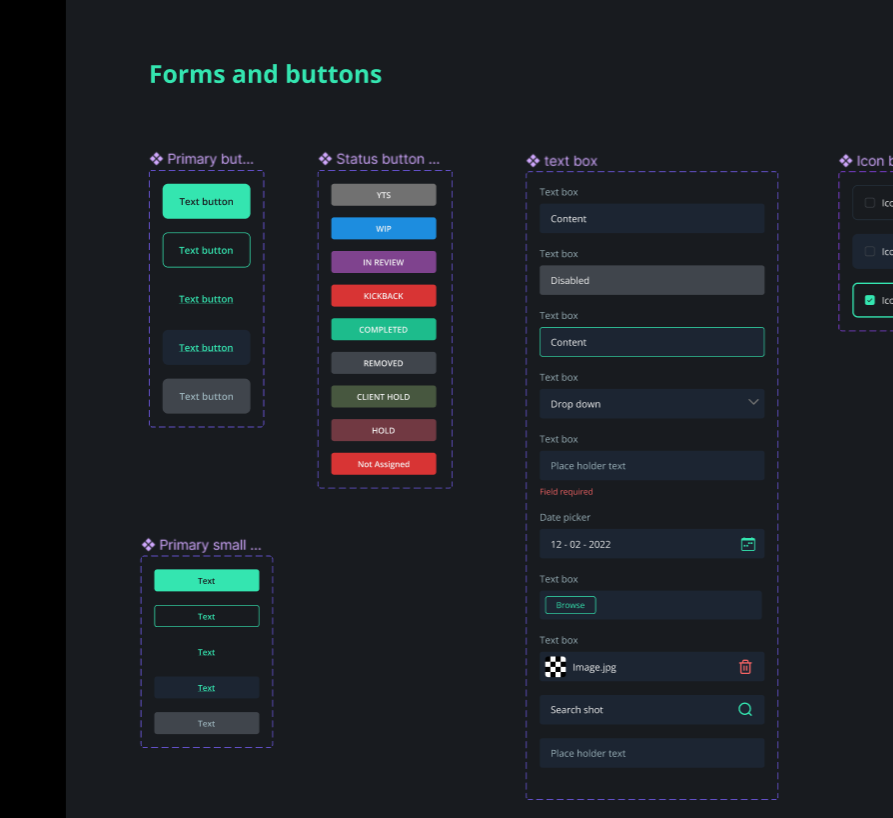
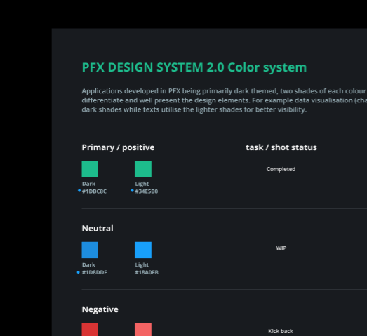
3. Removing Jargon & Cognitive Noise
Each department had introduced its own terminology into the tool over time. This created confusion across roles.
I:
- Standardized naming conventions
- Removed unnecessary data fields
- Simplified labels and acronyms
- Added contextual feedback (error, success, warning states)
This reduced onboarding friction and cross-team misunderstandings.
4. Introducing Metrics That Matter
The original system showed numbers.
It didn’t show insight.
I defined and visualized:
- Budget burn
- Progress velocity
- Productivity metrics
- Forecasts for resource allocation
Finance teams received a dedicated view for financial tracking, while production teams gained visibility into operational health.
The system shifted from passive tracking to active decision support.
Designing Under Real Constraints
This wasn’t a greenfield SaaS rebuild.
Constraints included:
- Legacy backend architecture
- Engineering bandwidth limitations
- A live production environment that couldn’t tolerate downtime
Every solution had to balance:
- Development feasibility
- Operational stability
- User clarity
Instead of introducing technically complex automation, I prioritized structural improvements that delivered immediate clarity and reliability.
The Impact
After implementation and rollout:
- Adoption increased from <10% to 97% across 8 departments
- SUS improved from below 10 to 90+
- Excel-based parallel workflows were eliminated
- Load performance significantly improved due to smarter data loading patterns
More importantly, the system became part of daily studio operations.
It wasn’t just usable.
It became trusted.
Before and After Interfaces
More Snaps